Tác giả: Trần Anh Tuấn
Từ trước tới giờ mình tùy biến VSCode rất nhiều và cũng có nhiều người hỏi về các đoạn code tùy biến đó, người này hỏi, người kia hỏi cho nên mình viết luôn bài này tổng hợp code những cái tùy biến đấy cho các bạn luôn!

Trước khi mà các bạn có thể áp dụng được những đoạn code này vào thì các bạn cần xem video này trên kênh Youtube của mình để có thể hiểu cách làm nhé.
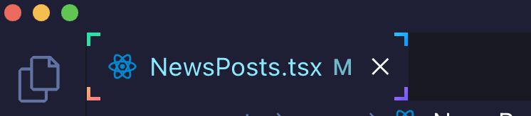
Tùy biến active tab 4 góc
:root{
--size: 5px;
}
.monaco-workbench
  .part.editor
  > .content
  .editor-group-container
  > .title
  .tabs-container
  > .tab.active.tab-border-top
  > .tab-border-top-container {
  width: 100%;
  height: 100%;
  top: 0;
  left: 0;
  background-color: transparent;
}
.monaco-workbench
  .part.editor
  > .content
  .editor-group-container
  > .title
  .tabs-container
  > .tab.active.tab-border-top
  > .tab-border-top-container:before,
.monaco-workbench
  .part.editor
  > .content
  .editor-group-container
  > .title
  .tabs-container
  > .tab.active.tab-border-top
  > .tab-border-top-container:after {
  content: "";
  width: var(--size);
  height: var(--size);
  position: absolute;
  border: 2px solid;
  border-image-slice: 1;
}
.monaco-workbench
  .part.editor
  > .content
  .editor-group-container
  > .title
  .tabs-container
  > .tab.active.tab-border-top
  > .tab-border-top-container:before {
  top: 0;
  left: 0;
  border-right: 0;
  border-bottom: 0;
  border-image-source: linear-gradient(-45deg, #4dd78a, #20e3b2);
}

.monaco-workbench
  .part.editor
  > .content
  .editor-group-container
  > .title
  .tabs-container
  > .tab.active.tab-border-top
  > .tab-border-top-container:after {
  right: 0;
  bottom: 0;
  border-top: 0;
  border-left: 0;
  border-image-source: linear-gradient(-45deg, #6a5af9, #d66efd);
}
.monaco-workbench
  .part.editor
  > .content
  .editor-group-container
  > .title
  .tabs-container
  > .tab.active:before,
 .monaco-workbench
  .part.editor
  > .content
  .editor-group-container
  > .title
  .tabs-container
  > .tab.active:after {
  content: "";
  width: var(--size);
  height: var(--size);
  position: absolute;
  border: 2px solid;
  border-image-slice: 1;
}
.monaco-workbench
  .part.editor
  > .content
  .editor-group-container
  > .title
  .tabs-container
  > .tab.active:before {
  left: 0;
  bottom: 0;
  border-top: 0;
  border-right: 0;
  border-image-source: linear-gradient(-45deg, #fc6c8f, #ffb86c);
}

.monaco-workbench
  .part.editor
  > .content
  .editor-group-container
  > .title
  .tabs-container
  > .tab.active:after {
  top: 0;
  right: 0;
  border-left: 0;
  border-bottom: 0;
  border-image-source: linear-gradient(-45deg, #098dff, #2cccff);
}
Lưu ý: Ở đoạn code trên các bạn sẽ thấy đoạn .tab-border-top thì tùy vào theme, ví dụ theme Dracula sẽ có border-top nhưng một số theme khác thì lại có border-bottom nên class của theme khác có thể là .tab-border-bottom. Cho nên các bạn linh động thay class phù hợp là chạy ổn áp nha.
Tùy biến active tab line gradient
Sử dụng đoạn code này thì khi active tab sẽ có một đường line ở trên cái tab khi mà nó active trong VSCode và nó sẽ chạy qua chạy lại với nhiều màu sắc cho các bạn.
Lưu ý: Cũng tương tự như ở trên thì tùy thuộc vào theme thì sẽ có .tab-border-top hoặc .tab-border-bottom. Các bạn chỉ cần thay vào là chạy đúng kết quả các bạn muốn thôi nhé.
.monaco-workbench
  .part.editor
  > .content
  .editor-group-container
  > .title
  .tabs-container
  > .tab.active.tab-border-top
  > .tab-border-top-container {
  background-size: 400% 400%;
  background-image: linear-gradient(
    -45deg,
    #fc6c8f,
    #ff2ced,
    #ffb86c,
    #2cccff,
    #20e3b2,
    #ffcc70,
    #c850c0,
    #4158d0
  );
  animation: gradient 5s ease alternate infinite;
  height: 3px;
}
@keyframes gradient {
  0% {
    background-position: 0% 50%;
  }
  50% {
    background-position: 100% 50%;
  }
  100% {
    background-position: 0% 50%;
  }
}
Tùy biến font chữ cho các class
Nhiều bạn hỏi mình sao làm cho chỗ này nó có font chữ khác thì mình cũng chia sẻ cho các bạn luôn. Đầu tiên các bạn cần tải font Dank Mono và cài đặt cho máy tính của các bạn tại đây
Sau khi tải và cài đặt xong cho máy tính rồi thì áp dụng đoạn code này vào là được
.mtk5,
.mtk26 {
  -webkit-font-smoothing: auto;
  font-family: "Dank mono", monospace;
}
.mtk26 {
  font-style: italic;
}
Hãy lưu ý rằng hai class .mtk5 và .mtk26 là tương ứng cho theme mình đang xài(Evondev Dracula), nếu các bạn xài theme khác thì tự tìm class nhé vì mỗi theme thì class nó khác nhau. Tìm như thế nào thì coi video ở trên cùng. Mình đã chỉ tận răng rồi cho nên mấy vấn đề này mình không có hỗ trợ riêng đâu nhé.
Nếu làm theo vẫn chưa được thì có thể tham khảo thêm đoạn code dưới đây, đoạn này bỏ vào trong file settings.json của các bạn nhé. Trong đó Evondev Dracula Normal Contrast là tên theme của các bạn
"[Evondev Dracula Normal Constrast]": {
  "textMateRules": [
    {
      "scope": [
        "entity.other.attribute-name.js",
        "entity.other.attribute-name.jsx",
        "entity.other.attribute-name.ts",
        "entity.other.attribute-name.tsx",
        "entity.other.attribute-name.html",
        "entity.other.attribute-name.pug"
      ],
      "settings": {
        "foreground": "#20e4b2"
      }
    }
  ]
}
Đoạn tùy chỉnh JSON ở trên mục đích là tách cái thuộc tính(attribute) trong thẻ HTML thành một scope riêng biệt để nó sinh ra một class mới như .mtk26 chẳng hạn rồi dựa vào class đó tùy biến màu khác, in nghiêng… tùy vào mục đích mỗi người.
Tùy biến con trỏ
.cursors-layer .cursor {
  background-image: linear-gradient(
    245deg,
    #fcb564,
    #ff65f2,
    #d66efd
  ) !important;
}
Bo góc Tab
.tabs-container > .tab {
  border-right: 0 !important;
}
.tabs-and-actions-container {
  padding: 4px !important;
}

.tabs-container {
  gap: 8px !important;
}
.tabs-container > .tab.active.tab-border-top > .tab-border-top-container {
  --general-gradient-secondary: #fcb564, #ff65f2, #ff69cf;
  height: 0.5px !important;
  background-image: linear-gradient(
    to right,
    var(--general-gradient-secondary)
  );
  width: 50% !important;
  left: 50% !important;
  transform: translate3d(-50%, 0%, 0) !important;
  top: -1px !important;
}
.tabs-container > .tab {
  border-radius: 100px;
  border-color: rgba(255, 255, 255, 0.12) rgb(25, 26, 33)
    rgba(255, 255, 255, 0.12) rgba(255, 255, 255, 0.12);
  border-style: solid;
  border-width: 1px 0 0 0;
}
Border gradient
.monaco-workbench
  .part.editor
  > .content
  .editor-group-container
  > .title
  .tabs-container {
  padding: 8px;
  gap: 8px;
}
.monaco-workbench
  .part.editor
  > .content
  .editor-group-container
  > .title
  .tabs-container
  > .tab.sizing-fit {
  background-color: #21222c !important;
  border-radius: 4px;
}
.tab.tab-actions-right.sizing-fit.has-icon.tab-border-top.active .tab-label {
  position: relative;
}
.tab.tab-actions-right.sizing-fit.has-icon.tab-border-top.active:before {
  content: "";
  position: absolute;
  background: #21222c;
  top: 50%;
  left: 50%;
  width: calc(100% - 2px);
  height: calc(100% - 2px);
  border-radius: inherit;
  transform: translate(-50.1%, -50.1%);
  border-radius: inherit;
}
.monaco-workbench
  .part.editor
  > .content
  .editor-group-container
  > .title
  .tabs-container
  > .tab.sizing-fit.active {
  background-image: linear-gradient(
    45deg,
    #fcb564,
    #ff65f2,
    #d66efd,
    #6a5af9,
    #2cccff,
    #20e3b2
  );
}
/* hide border top */
.monaco-workbench
  .part.editor
  > .content
  .editor-group-container
  > .title
  .tabs-container
  > .tab.active.tab-border-top
  > .tab-border-top-container {
 display: none !important;
 }
Dành cho ai dùng theme Evondev Dracula
Đây là toàn bộ code tùy biến hiện tại của mình, nếu bạn thích thì có thể copy vào hết là y hệt mình, tuy nhiên nếu bạn đang dùng máy có độ phân giải cao thì nó sẽ đẹp hơn nhé, ví dụ như Macbook chẳng hạn
:root {
 --gradient-dir1: to top right;
 --gradient-dir2: to bottom left;
 --gradient-dir3: to right top;
 --gradient-dir4: to left bottom;
 --gradient-dir5: to top left;
 --size: 5px;
}
.mtk10,
.mtk15 {
 color: transparent;
 background-image: linear-gradient(var(--gradient-dir4), #fc806c, #ff1bd1);
 -webkit-background-clip: text;
 background-clip: text;
 -webkit-text-fill-color: transparent;
}

.mtk5,
.mtk26 {
 color: transparent;
 background-image: linear-gradient(
   var(--gradient-dir1),
   #4dd78a,
   #20e3b2,
   #a2de6a
 );
 background-clip: text;
 -webkit-text-fill-color: transparent;
 -webkit-background-clip: text;
 -webkit-font-smoothing: auto;
 font-family: "Dank mono", monospace;
 font-size: 14px;
}
.mtk26 {
 background-image: linear-gradient(
   var(--gradient-dir5),
   #4dd78a,
   #20e3b2,
   #a2de6a
 );
 font-style: italic;
}
.mtk23,
.mtk16 {
 color: transparent;
 background-image: linear-gradient(var(--gradient-dir1), #d66efd, #6a5af9);
 background-clip: text;
 -webkit-text-fill-color: transparent;
 -webkit-background-clip: text;
}
.mtk9,
.mtk17 {
 color: transparent;
 background-image: linear-gradient(
   var(--gradient-dir2),
   #098dff,
   #2cccff,
   #2979ff
 );
 background-clip: text;
 -webkit-text-fill-color: transparent;
 -webkit-background-clip: text;
}
.mtk18 {
 color: transparent;
 background-image: linear-gradient(var(--gradient-dir2), #b0beff, #fed9ff);
 background-clip: text;
 -webkit-text-fill-color: transparent;
 -webkit-background-clip: text;
 font-style: normal;
}
.mtk3 {
 color: transparent;
 /* background-image: linear-gradient(
   var(--gradient-dir1),
   #c29ffd,
   #ffb4dc,
   #e39bf7
 ); */
 background-image: linear-gradient(to top, #fce1d0, #ffadd6, #e39bf7);
 background-clip: text;
 -webkit-text-fill-color: transparent;
 -webkit-background-clip: text;
}
.mtk7 {
 color: transparent;
 background-image: linear-gradient(var(--gradient-dir2), #fc6c8f, #ffb86c);
 -webkit-background-clip: text;
 background-clip: text;
 -webkit-text-fill-color: transparent;
}
.mtk8,
.mtk14 {
 color: transparent;
 background-image: linear-gradient(to right, #ffb88c, #eac394);
 -webkit-background-clip: text;
 background-clip: text;
 -webkit-text-fill-color: transparent;
}
.monaco-workbench
 .activitybar
 > .content
 :not(.monaco-menu)
 > .monaco-action-bar
 .action-item.checked
 .active-item-indicator:before {
 border: 0;
 width: 3px;
 height: 100%;
 position: absolute;
 top: 0;
 left: 0;
 background-image: linear-gradient(45deg, #fc6c8f, #ff2ced);
}

.monaco-workbench
 .activitybar
 > .content
 :not(.monaco-menu)
 > .monaco-action-bar
 .badge
 .badge-content {
 background-image: linear-gradient(45deg, #fc6c8f, #ff2ced);
}
.monaco-editor .cursors-layer .cursor {
 background-image: linear-gradient(to top, #6a5af9, #d66efd, #fc6c8f, #ff2ced);
}

.mtki {
 font-style: normal;
}

.monaco-workbench
 .part.editor
 > .content
 .editor-group-container
 > .title
 .tabs-container
 > .tab.active.tab-border-top
 > .tab-border-top-container {
 width: 100%;
 height: 100%;
 top: 0;
 left: 0;
 background-color: transparent;
}
.monaco-workbench
 .part.editor
 > .content
 .editor-group-container
 > .title
 .tabs-container
 > .tab.active.tab-border-top
 > .tab-border-top-container:before,
.monaco-workbench
 .part.editor
 > .conten
 .editor-group-container
 > .title
 .tabs-container
 > .tab.active.tab-border-top
 > .tab-border-top-container:after {
 content: "";
 width: var(--size);
 height: var(--size);
 position: absolute;
 border: 2px solid;
 border-image-slice: 1;
}
.monaco-workbench
 .part.editor
 > .content
 .editor-group-container
 > .title
 .tabs-container
 > .tab.active.tab-border-top
 > .tab-border-top-container:before {
 top: 0;
 left: 0;
 border-right: 0;
 border-bottom: 0;
 border-image-source: linear-gradient(-45deg, #4dd78a, #20e3b2);
}
.monaco-workbench
 .part.editor
 > .content
 .editor-group-container
 > .title
 .tabs-container
 > .tab.active.tab-border-top
 > .tab-border-top-container:after {
 right: 0;
 bottom: 0;
 border-top: 0;
 border-left: 0;
 border-image-source: linear-gradient(-45deg, #6a5af9, #d66efd);
}
.monaco-workbench
 .part.editor
 > .content
 .editor-group-container
 > .title
 .tabs-container
 > .tab.active:before,
.monaco-workbench
 .part.editor
 > .content
 .editor-group-container
 > .title
 .tabs-container
 > .tab.active:after {
 content: "";
 width: var(--size);
 height: var(--size);
 position: absolute;
 border: 2px solid;
 border-image-slice: 1;
}
.monaco-workbench
 .part.editor
 > .content
 .editor-group-container
 > .title
 .tabs-container
 > .tab.active:before {
 left: 0;
 bottom: 0;
 border-top: 0;
 border-right: 0;
 border-image-source: linear-gradient(-45deg, #fc6c8f, #ffb86c);
}

.monaco-workbench
 .part.editor
 > .content
 .editor-group-container
 > .title
 .tabs-container
 > .tab.active:after {
 top: 0;
 right: 0;
 border-left: 0;
 border-bottom: 0;
 border-image-source: linear-gradient(-45deg, #098dff, #2cccff);
}
Tạm kết
Trên đây là toàn bộ source code tùy biến hiện tại của mình. Hi vọng bài viết ngắn gọn súc tích này sẽ có ích cho các bạn. Giúp các bạn có cảm hứng khi coding hơn.
Bài viết gốc được đăng tải tại evondev.com
Xem thêm:
- Hướng dẫn cách Debug TypeScript trên Visual Studio Code
- 5 VS Code Extensions hữu ích cho React developers
- 13 phím tắt trong VS Code hữu ích giúp lập trình dễ dàng hơn
Xem thêm Việc làm IT hấp dẫn trên TopDev